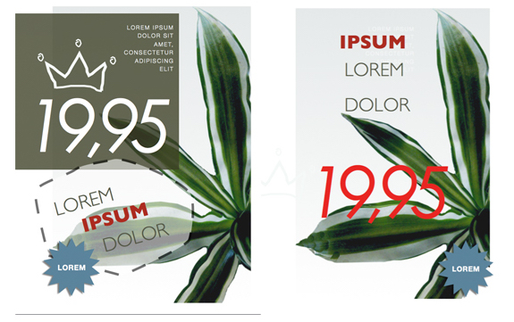
Alignment
Another important design principle is aligning elements in a visual and readable arrangement. Most amateur designers start off by aligning everything in the center of the page, but that’s not the only way. Again with the “scattered” looking design, we can see the alignment of elements that helps keep the design balanced. The top group of text is left-aligned, and three larger text elements are vertically aligned.

It’s important to be consistent in the alignment of elements. When you look at the design and something doesn’t feel right, play around with the alignment and see if the design can be improved.
Repetition
Like the use of repetitious hooks in a song, repeating elements in a graphic design can be visually appealing. In the two examples below, a numbered list is used, but there’s also the repetition of the blue circles that make a bolder statement.

In the layout on the right, the image of the sandwiched is cropped and masked in repeating squares, as well as the use of repeated red strokes above the word “PANE.” Repetition puts emphasis on particular elements of a design, and it draws the reader’s attention to those elements.
Contrast
Contrast between design elements can make a presentation stand out and get noticed. Take for example this original template from the personal graphic design site, Canva.com. The elements of the design are grouped together, with strong alignment and repetition of of the arrows and bullet points. But for some purposes, the original design could be a little flat.Making Beautiful Designs The Easy Way With Canva [Signup & Free Credit] Making Beautiful Designs The Easy Way With Canva [Signup & Free Credit]What if an application promised to make it possible for anyone to create aesthetically pleasing designs? What if creating a genuinely beautiful design was just a matter of dragging and dropping?READ MORE

Adding color contrast makes the design pop, and it draws attention to important parts of the presentation and message.

Notice another piece of contrast: the two arrows are followed by the check in the circle, which sends a visual message. The color of that element could also be changed to add contrast.
White Space
Depending on the presentation, the use of white space can be very powerful in design. It’s useful when you want to make a direct message, to stand out above the clutter found in many graphic designs. In this Canva business card template, the empty space helps bring clarity to the message.

A card reader first sees the graphic element, then the owner’s name, followed by the contact information. Elements on the card are balanced and uncluttered.
The same goes for this the coversheet of this Pages project proposal template. The white space provides room for the clean font style of the title, the graphic elements, and the grouped text. Don’t be afraid of leaving white space in your design. As Robin Williams points out, white space can also be a form of contrast.

Learning Graphic Principles
I’m not a graphic designer, but years ago I learned a lot from working through the exercises of Robin Williams’ book. Canva.com also provides several design tutorials that cover the above basic principles and several other design techniques. The site makes it easy for users to customize templates and save designs for later use.
Try your hand at applying the above principles to your next graphic design project, and let us know your thoughts, ideas, and tips for learning graphic design.


 WhatsApp us